Disclaimer: I am a listener of KHCB and Have Recieved Pens from Them (Unrelated to the Review)
KHCB is a Christian radio station based in Houston. The station has signals in other US states and a web broadcast that goes around the world. They just celebrated the 60th year anniversary and The old website was basically a player for the stream and not much else. Now the new website features on-demand content and a new part of the site called Upliftd. (Spelling explanation in the link.)
The new player and the website aesthetic is cleaner and the theme colors are white and gray. The KHCB site features the player at the bottom and the Upliftd blog at the top right sidebar of the site. Further down the sidebar, you can see the feature speakers, Verse of the Week, social share buttons and the donation button. The player allows for two streams the Upliftd stream and the normal KHCB stream. The stream has changed as well. There is no option for the quality of streaming anymore.
The top of the site has moving images that showcase new blog post's and events. However, these images are about too big and you have to scroll down to see the title/link of the Blog post. The bottom of the site has all the links on the site from KHCB and Upliftd. Links include the Church Calendar that allows you to submit a church event. There is also the broadcast schedule which is pretty accurate. But a few old programs that are not airing right now are still listed.
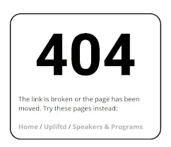
At the bottom of each blog post, there are buttons where you can go to the post before and after it. On the right hand of the sidebar, you can visit the author's website and a button to see all the articles written by that author. The author's website opens in a new tab, which is not recommended for acessibility. There are social share buttons, but they blend in with the site aesthetic because the icons are gray. There is also a hamburger menu on the sidebar that works well and shows the same links from the bottom of the page. The 404 page just says 404 and gives the links back to the site.
 |
| Even the error page fits with the astetic. |
The website is mobile-friendly. It uses the same layout and template, but it scales everything down for the smaller screen. I did notice some weird text at the bottom of both sites when you visit the privacy policy page. The site works with and without an adblocker. However, it does not matter because the station and the website do not have advertisements. In conclusion, this is a great radio station and the redesign is fairly good.
Tech Talk To You Later!!


Please make the comments constructive, and vulgarity will not be tolerated!